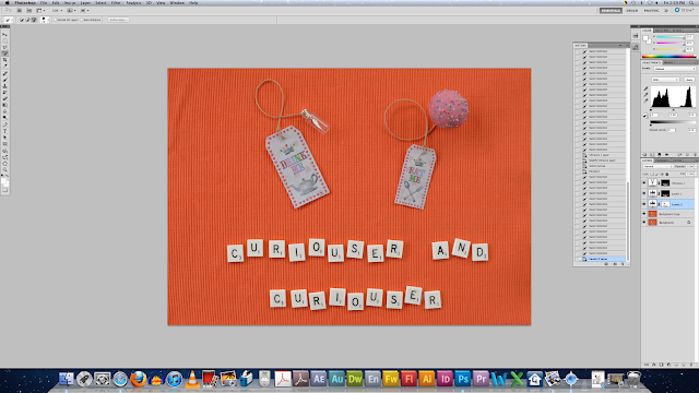
Using photograph taken in third round of my photography for Alice Theme:
I decided to use a cupcake instead of a slice of cake, and a bigger 'drink me' card.
Open chosen image in Photoshop:
Crop View:
Duplicate Layer FIRST:
Then Crop View:
Select scrabble tiles:
Create Adjustment Layer Levels:
Modify Adjustment Layer Levels:
Create Adjustment Layer Vibrance:
Select Background:
Create Adjustment Layer Levels:
Select Cards:
Create Adjustment Layer Hue and Saturation:
Use Paint Brush tool to adjust edges:
Use Clone Tool to remove 'spots':
Select Potion Bottle:
Create Adjustment Layer Levels:
Use Clone Stamp Tool to edit 'spots':
Use Paint Brush Tool to fix edges of Adjustment Layer Levels:
Select Cupcake:
Create Adjustment Layer Levels:
Clone Stampl Tool to remove 'spots' (I keep finding more and more of them):
I'm happier with how this round of editing has turned out in comparison to the first round! I think the orange background represents the Alice theme a lot better than the navy/grey wicker texture of the previous trial. The difference in the size of the drink me and eat me cards makes a lot of difference, in comparison to the last one when they were too small and both the same size! I like the cupcake better than the cake because visually it looks more appealing than the slice of cake! I'm not too sure I like this photograph as the final, it needs something more...


No comments:
Post a Comment